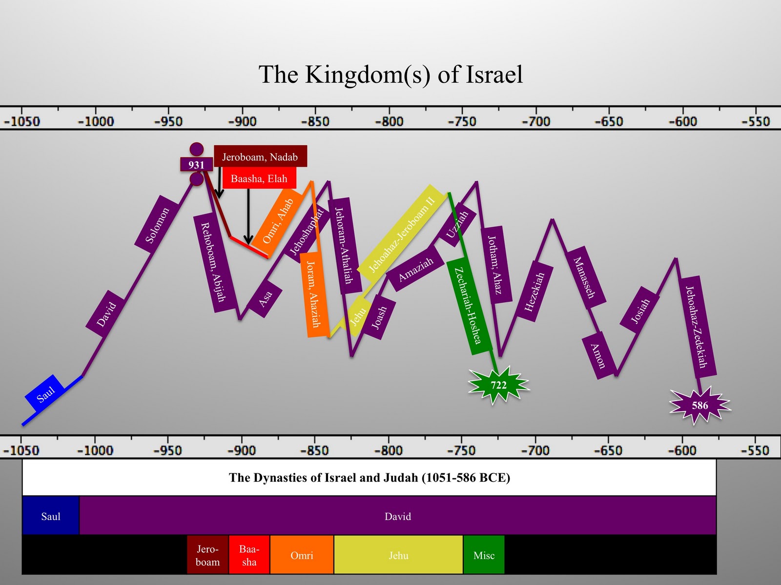
For instance, one of my major research goals is to understand and contrast the relationship between Jehoshaphat king of Judah (873-848 BCE) and Ahab king of Israel (874-853 BCE) – while at the same time comparing the allied front of Ahab/Jehoshaphat to the Solomonic kingdom. Were their respective reigns a return to Solomonic glory? Something more? Something less? Was Jehoshaphat merely a vassal to the almighty Ahab? This chart does not answer these questions – but it allows the researcher and student alike to take into account the biblical, epigraphic, and archaeological data in the form of a “peak” or “valley.”
This chart represents my own understanding of the biblical and archaeological history of ancient Israel (i.e. very conservative). It would be exceptionally helpful if the other side would create their own “peaks and valleys” chart – then we could compare geography. Admittedly, their chart would not be quite as interesting (think Texas compared to California) – since it would be one long arduous climb out of the “valley” with only a couple “peaks” at the end.

6 thoughts on “Chart: The Kingdom(s) of Israel”
Chris,
What are the factors measured by the up and down nature of the chart? In other words, what would the labels be along the left side of the chart?
Chris,
I really love your chart about the kingdom(s)of Israel. It puts everything in a very colorful and visual form, making it easy to understand. If you have not already done so, I think it would be great to have this available for sale in poster form. In addition, it could also be done in a way that allows students/teachers to stick the various rulers onto the chart with velcro, for review or for keeping students of all ages participating or attentive in Bible classes.
Sincerely,
Nora
http://www.kaleidoscript.blogspot.com
Nora,
Thanks for the comments. I would be interested in offering the chart in a poster format. Feel free to use the chart in its current format for lectures and Bible classes.
Chris
Chris,
Thanks for the permission to use your chart. Send me an email if you get around to selling the poster.
Nora
Could I have permission to use this chart for a Bible study presentation?
Hi Angela! Sure – enjoy.